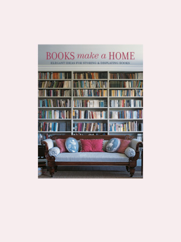
Books Make a Home by Damian Thompson,
published by Ryland Peters & Small (£35)
Photography © Ryland Peters & Small
Join Our World... Sign up for our exclusive newsletter.

Be inspired every day with Living North


‘I would be most content if my children grew up to be the kind of people who think decorating consists mostly of building enough bookcases’ (Anna Quindlen).
Books not only enrich the mind – they are increasingly designed to appeal to the eye. From towers to tableaux, from colour-coded stacks to leather-bound tomes on tables, the book’s ability as an aesthetic aid should not be underestimated.
‘Books are not made for furniture, but there is nothing else that so beautifully furnishes a house.’ When the Congregationalist preacher Henry Ward Beecher wrote these words in the mid-19th century, most educated homes of the middling sort possessed a small library of sombrely bound volumes neatly corralled into a parlour, study or alcove. Their decorative potential, in other words, was limited.
Nowadays, despite competition from other media, new titles continue to pour out of publishing houses, which often put as much effort into making their form desirable as they do into ensuring their content is worthwhile. An eye-catching jacket helps a book stand out in a crowded marketplace. And while such elements as decorative endpapers, heavy paper stock and glossy photographs all add to a publisher’s costs – and therefore the price consumers pay for the end product – books are, relative to income, cheap compared to the past. This can mean that bibliophiles have large numbers of these aesthetically pleasing objects and not enough shelf space to house them.
If that’s the case, make a virtue out of necessity. An artfully positioned stack of books can lead the eye towards an unassuming but finely executed pencil sketch in the corner of the room; equally it can divert attention away from a window with its eyesore of a tower block beyond. Speaking of which, a single ‘skyscraper’ of 30 or more books in the corner creates a powerful vertical accent among beds, low coffee tables and sprawling sofas, but they should be arranged in strictly diminishing order of size for added stability. Ideally, too, books should be regularly rotated into and out of this arrangement, so that bindings are not crushed over time. There are practical downsides, it must be said, not least the difficulty in retrieving the copy you want. Hi-fi equipment and Ming vases should be kept away from the topple radius, and if your household includes pets or toddlers, you might as well forget the idea.
Large books that rarely need to be consulted can form an eye-catching base for a glass table top – likewise serving as pedestals for speakers or telephones. For these kind of semi-permanent arrangements, think about positioning the books to create chromatic rhythms with, say, red- or black-coloured spines recurring at regular intervals.
Vladimir Nabokov wrote: ‘In reading one should notice and fondle details.’ The same applies to little tableaux that can be created on coffee tables, side chairs and cabinets. An antique lamp looks great propped up on a couple of matching faded leather tomes, while two low equal piles of books at either end of a bench in a hallway might echo the symmetry of the pictures or wall sconces on the wall above. In the warm months, when the fire is never lit, fill a wicker basket with a stack of art books and place it on a waxed wooden floor by the hearth – this will instantly perk up a moribund spot.


Bookends mean that you can enliven narrow surfaces, such as console tables, mantelpieces or reasonably wide window-sills, with little vertical runs. These simple devices work by a mixture of gravity and friction – the taller and heavier the block, and the rougher the contact between bookend and underlying surface, the stronger the support. For the kind of vignettes that we’re currently discussing, though, you should forget the large format coffee-table titles and the heavy cast-iron brackets or massive mahogany Ls that they would call for. Given the relatively simple physical forces at work, product designers have carte blanche to let their imaginations rip. Witty examples include a bold ‘A’ and ‘Z’; ‘pushing’ and ‘leaning’ Soviet Realist-style workers; and a Chinese dragon’s head at one end, with its tail emerging at the other end of the row. Most eye-catching of all the examples I have seen is two ‘halves’ of a fish bowl, complete with live tropical specimens, which leave what they enclose frankly upstaged.

What other techniques are there for showcasing the purely aesthetic qualities of your books? In some shelving units, it is possible to have the occasional shelf oriented on a slant, with a lip, just like a long lectern, so that you can face some covers outwards; this can also be done on regular shelves – just as bookshops do to promote titles with strong sales potential – breaking up an endless sea of spines with graphically bold or pictorially memorable jackets. Just like in an art gallery, one can ‘rotate’ regularly those you display.
Organising by colour offers a hit of pure pop-art pleasure; not only does the rainbow effect offer a wonderful focal point, but one can find new correspondences between subjects (on my own shelves, now that an Odilon Redon monograph, Phaidon’s three-volume Design Classics and a book on loft living are rubbing yellow shoulders, it sparks off new directions in lateral thinking). This approach works best with chunky hardbacks.
Finally, in some minimalist schemes, I have seen books arranged so that their tails and fore-edges face outward. All right, you can argue that, particularly if they’re all squashed in higgledy-piggledy, the textural effect of pages going in all directions can create an interesting abstract sculpture, a contrast from the ordered, cool neutrality elsewhere. But – sorry to state the blindingly obvious – I do want to be able to find a book without pulling apart my collection every time.

Books Make a Home by Damian Thompson,
published by Ryland Peters & Small (£35)
Photography © Ryland Peters & Small